Based on the business and their audiences, I can tailor learning solutions to comply with Section 508 Web Content Accessibility Guidelines (WCAG). But even when not required, I value making solutions accessible for all learners, such as being mindful when choosing colors, fonts, inclusive language, and interactive elements.
WCAG has four principles (perceivable, operable, understandable, and robust), over a dozen guidelines, and three levels of conformance (A, AA, AAA). Based on this, I’ve created an example for 1.4.3 (Perceivable: Contrast Minimum).
Out of the following four slides, can you guess which ones (if any) are accessible?


If someone has color vision deficiency or low vision, some of the slides may be difficult or impossible to read. You may be able to guess that some of the slides are not accessible, such as number 3 where the background image shows through so much that it is difficult to read some of the text. But other times, it may not be so obvious. Luckily, we do not have to guess. We can use an online contrast checker to determine if the color contrast conforms to WCAG.
I used the WebAIM contrast checker and added the images for the color combinations of the slides that passed WCAG. Review the following WebAIM images, and then navigate to the bottom of the page for the slides that are accessible.
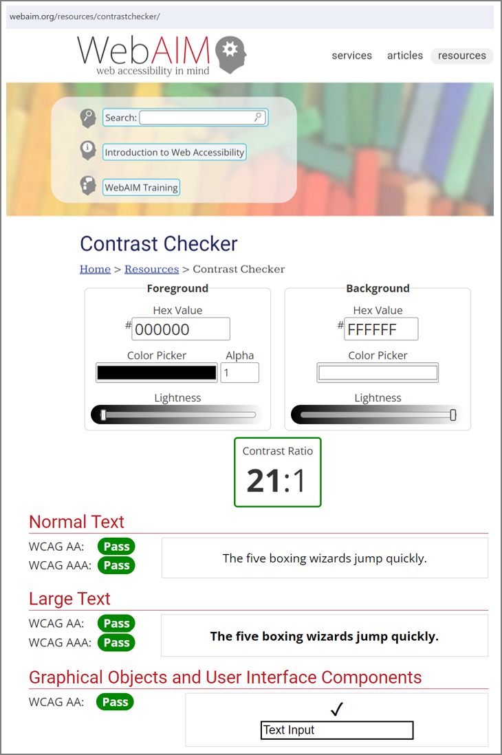
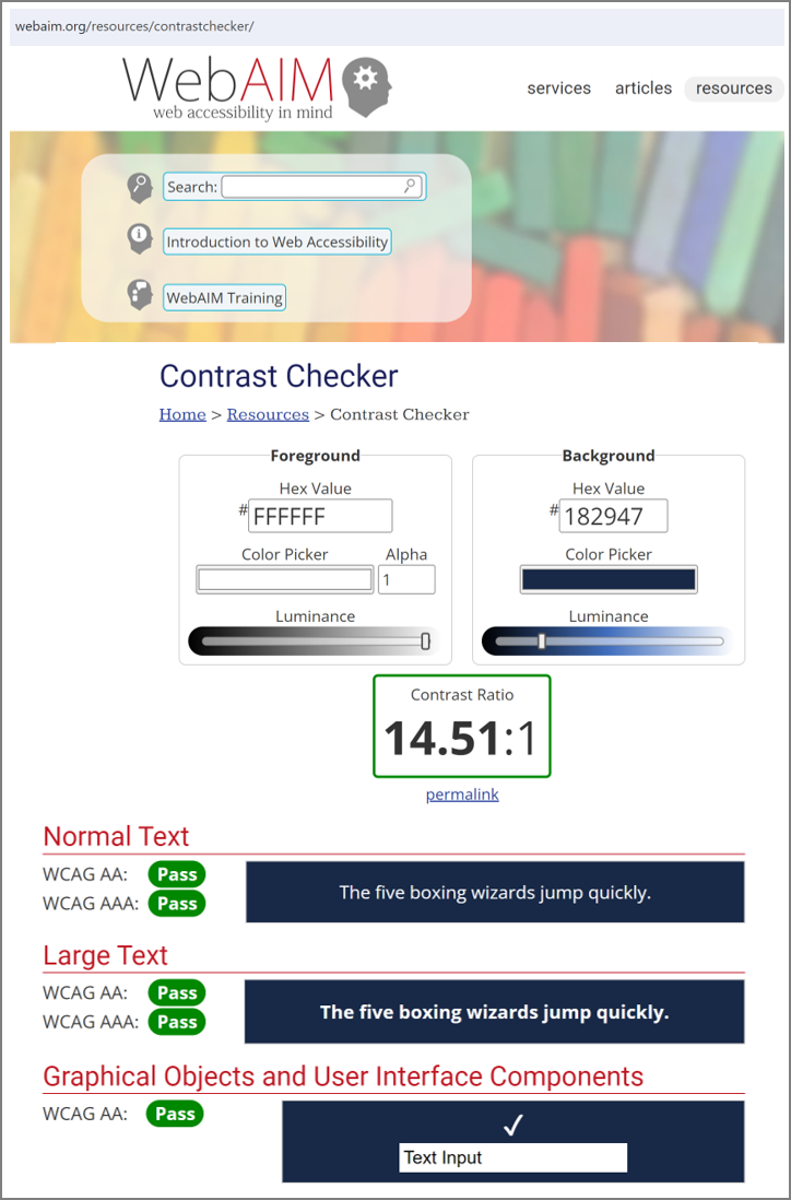
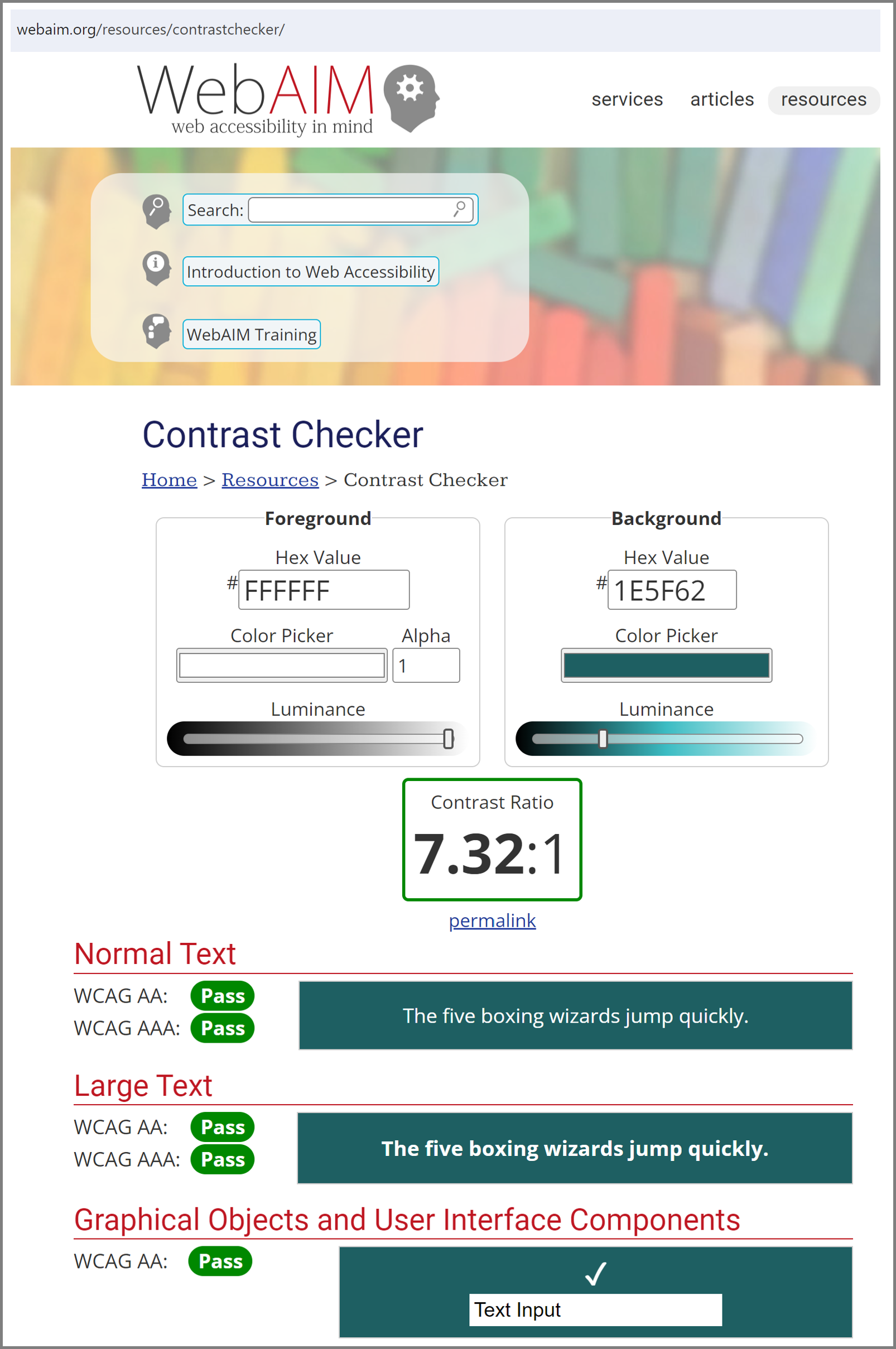
Based on this color contrast information, slides 2 and 4 conform to the WCAG accessibility guideline for contrast minimum.
More to come!
Of course this is only one small part of making learning solutions accessible. For future iterations of my portfolio, I will add other examples.
